
Microsoft Bing - Design Language
As part of Bing’s brand redesign, I was tasked to imagine how Bing’s design language could be revamped to work across platforms, current and future. This incubation work served an North Star guide to the design studio.
Responsibilities
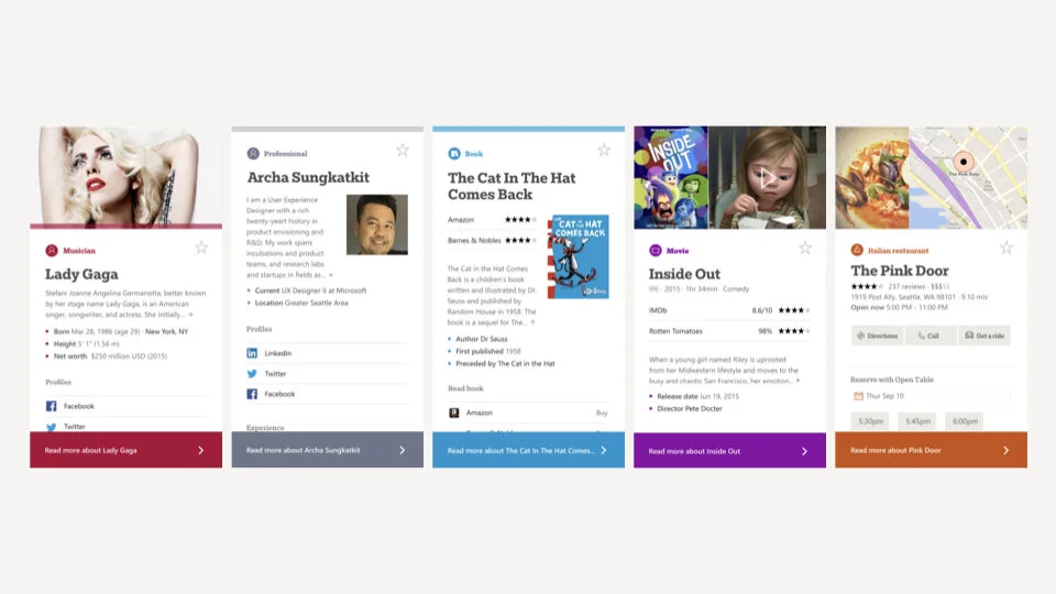
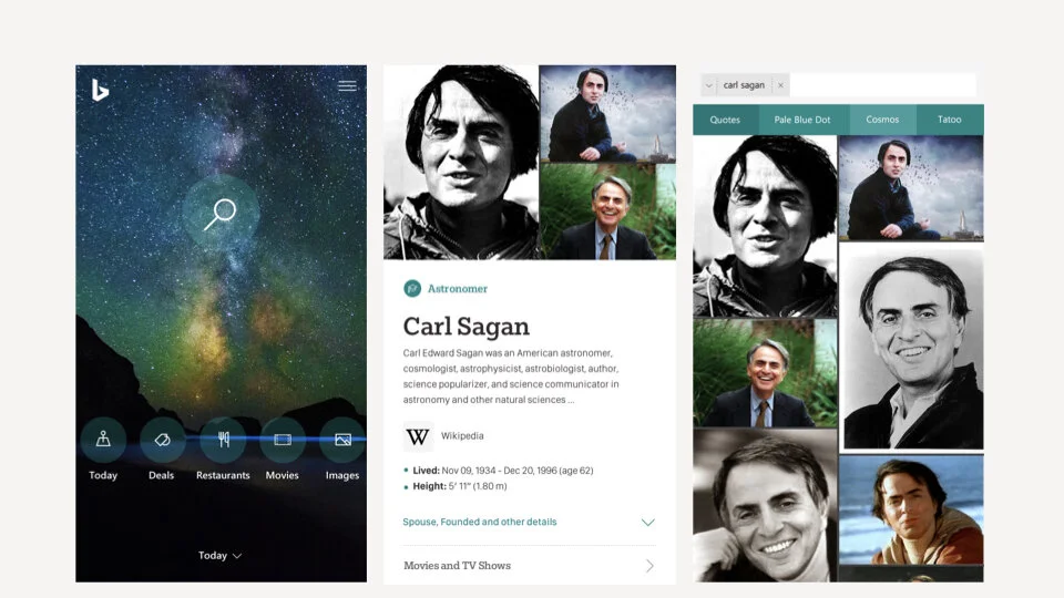
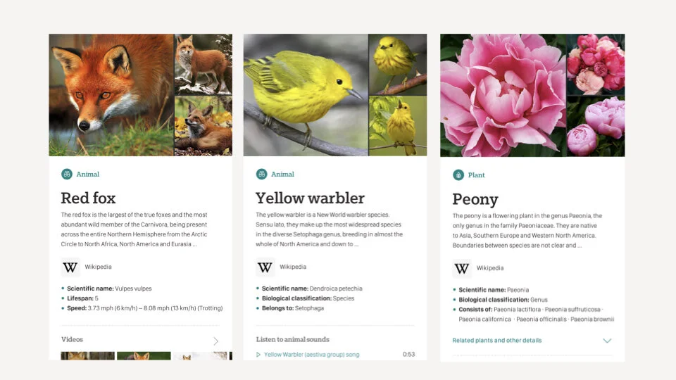
As 1 of 3 UX designers, I worked on entity snapshots —of people, places, and things. I performed visual audits, made mood boards to inform art direction, created designs across platforms, built prototypes to vet concepts, and co-conceptualized the brand video.
Creative Challenge + Process
Bing search is powered on many platforms —desktop, mobile, Windows OS and in 3rd party partnerships around the world. However, in expanding rapidly, our brand and visual identity were out of sync. We audited existing surfaces, tested art direction and stress-tested design systems across platforms to see how they’d perform.
Design Explorations
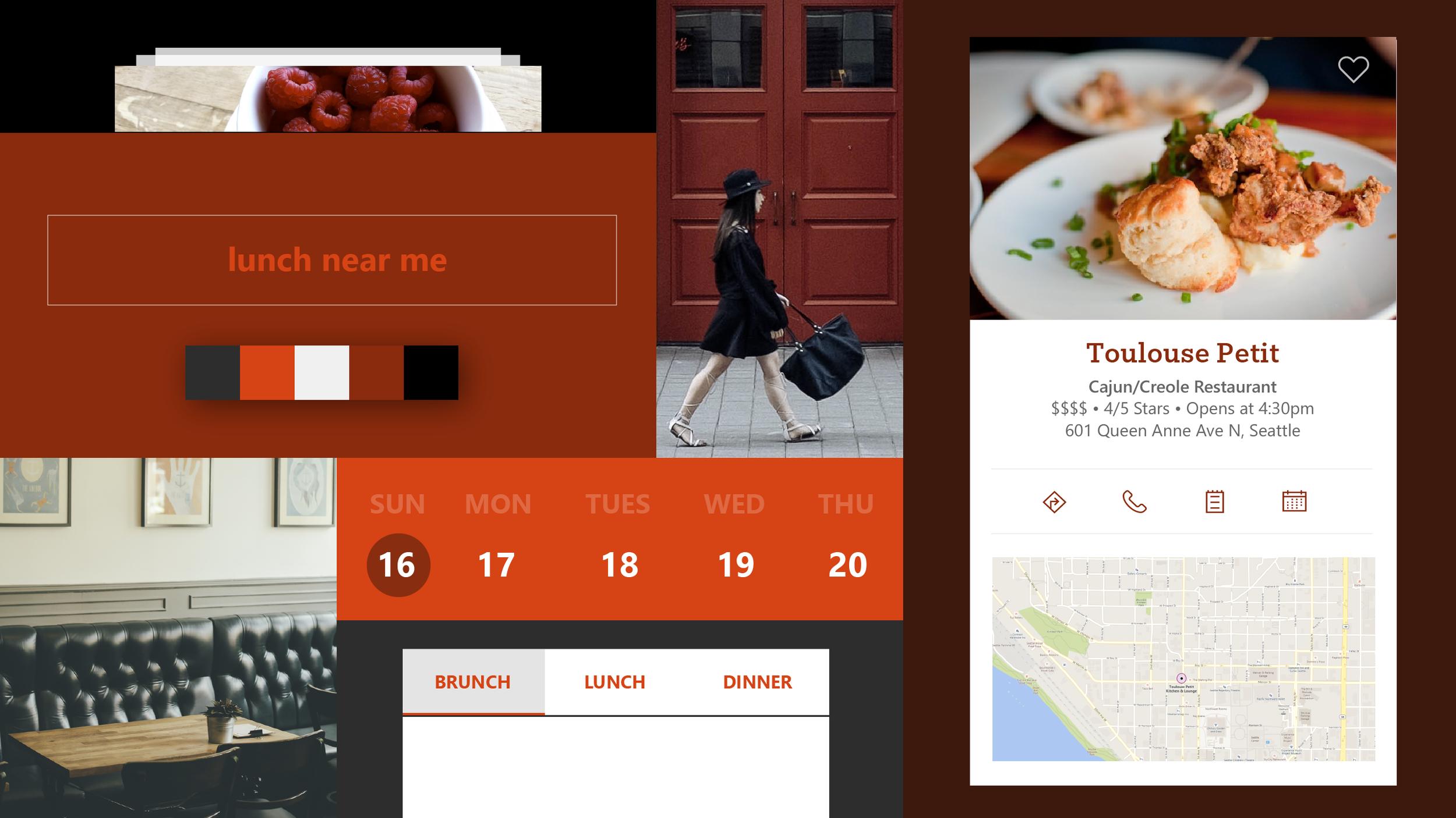
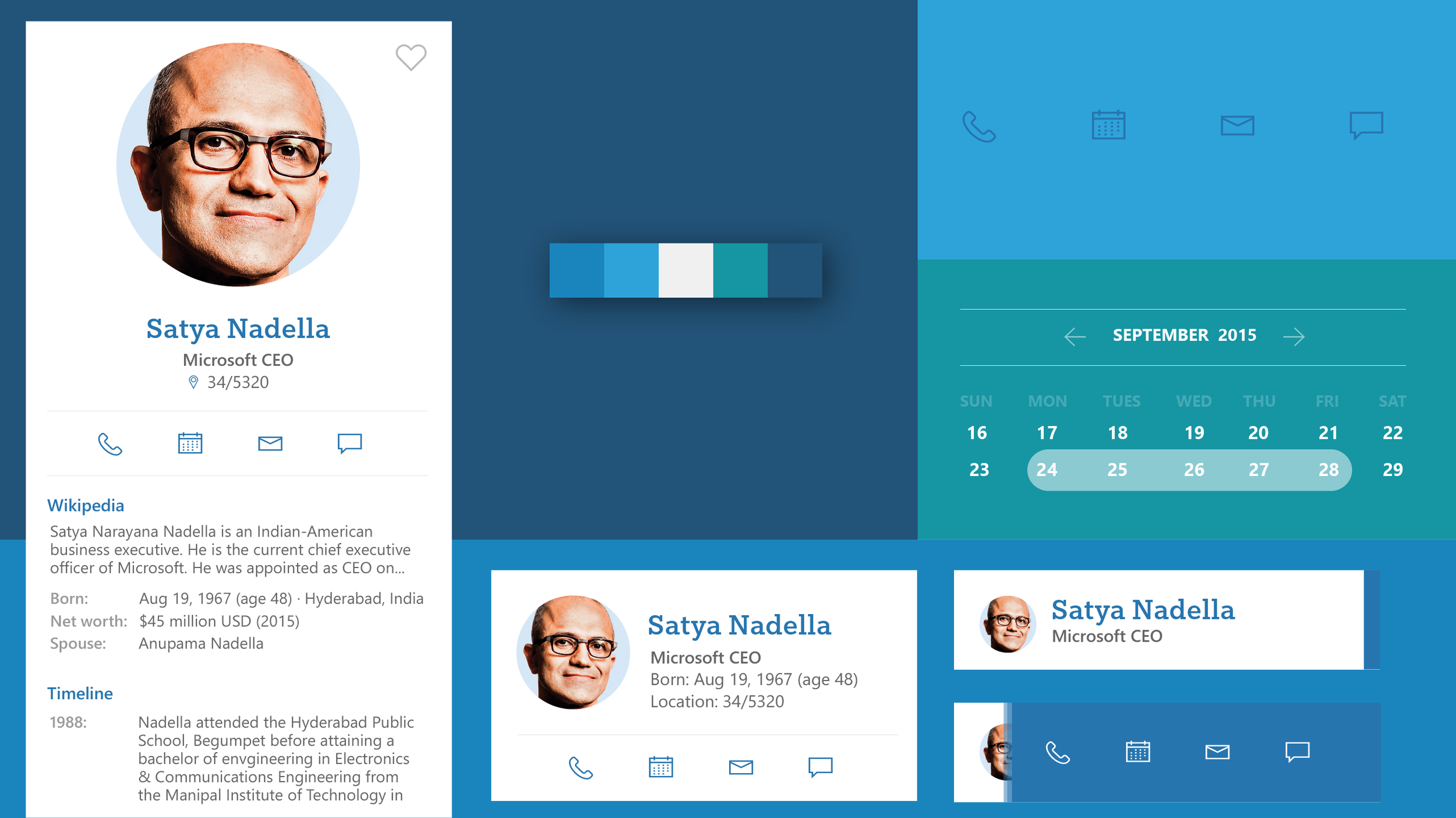
To guide our explorations, we defined principles to communicate what our brand stood for to our users and I created mood boards to see how art direction could be informed by the brand principles below:
Be confident to give users the right answer clearly
Present information intelligently/thoughtfully
Be intuitive in assisting users so they can take action
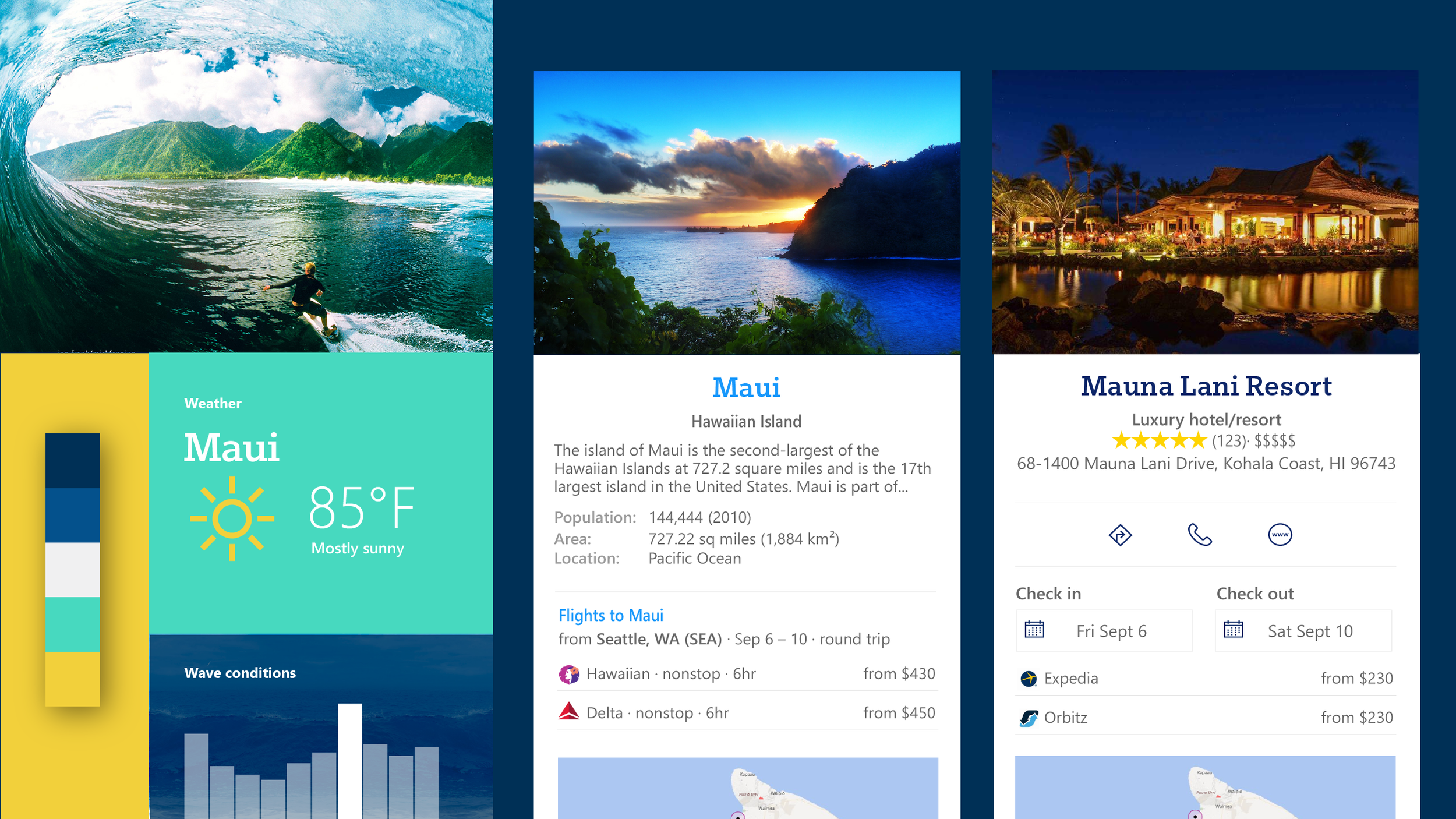
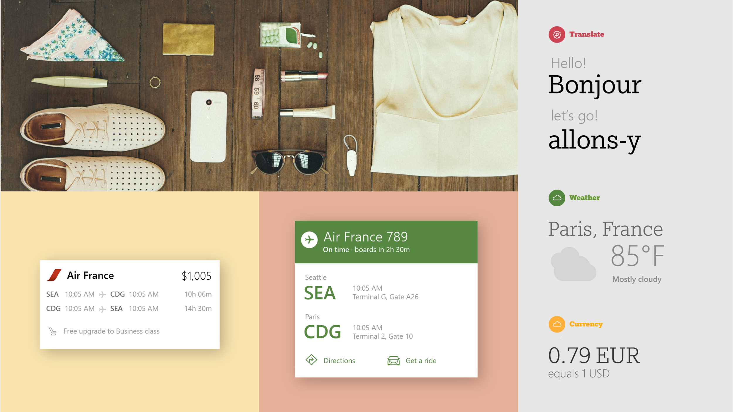
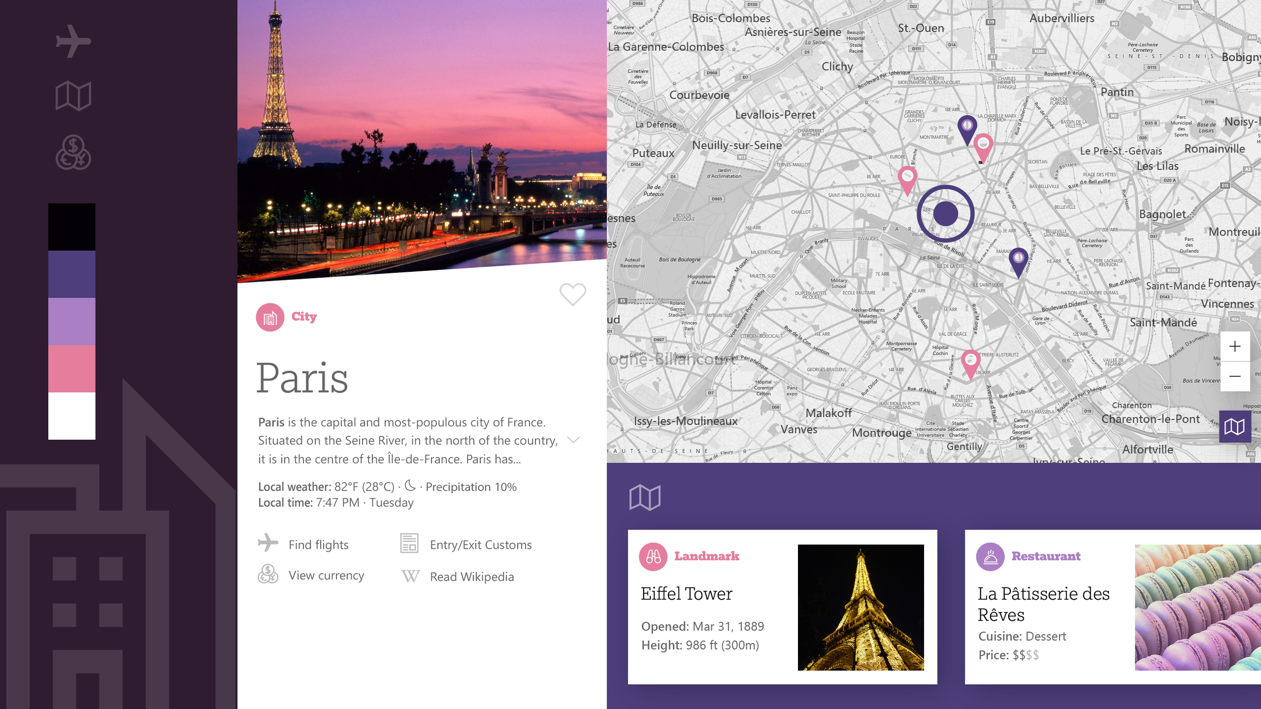
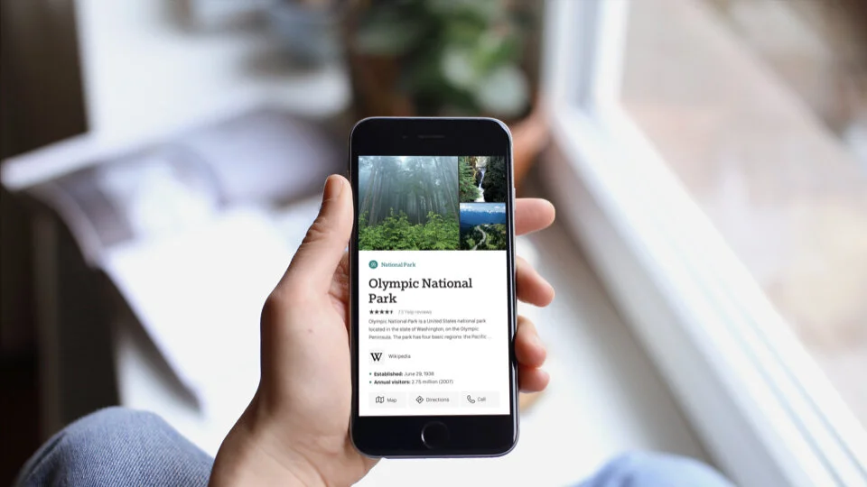
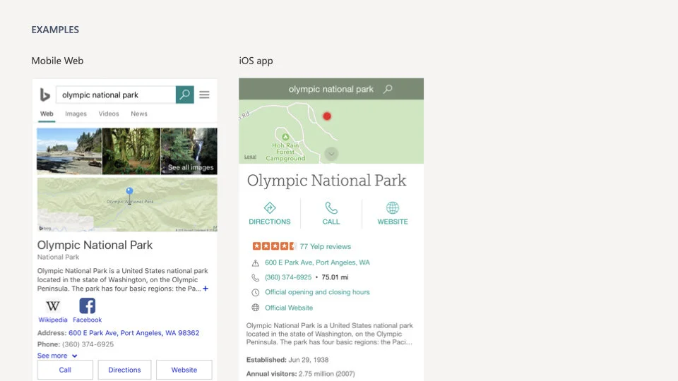
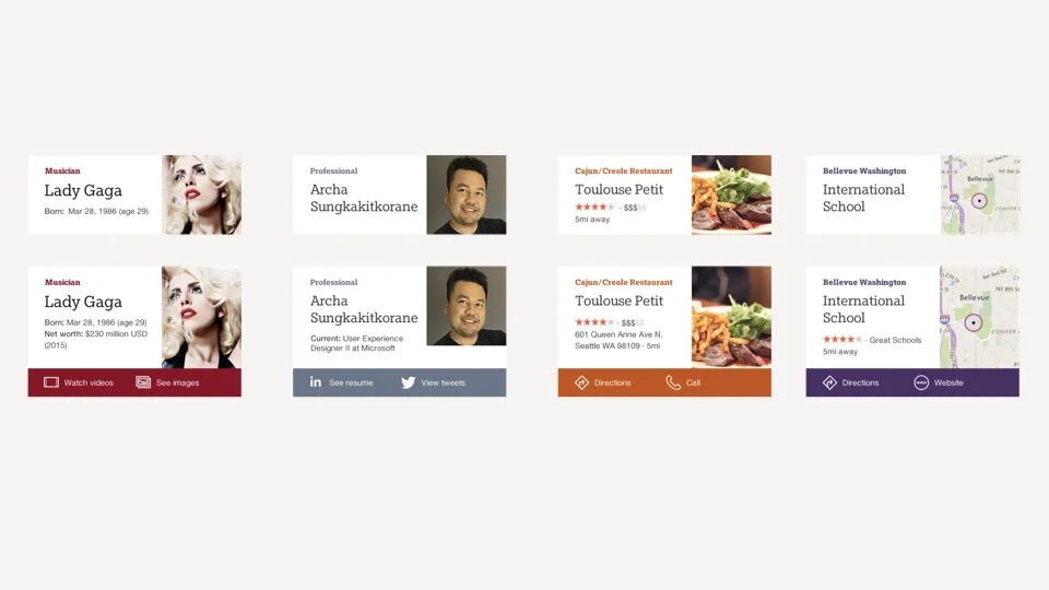
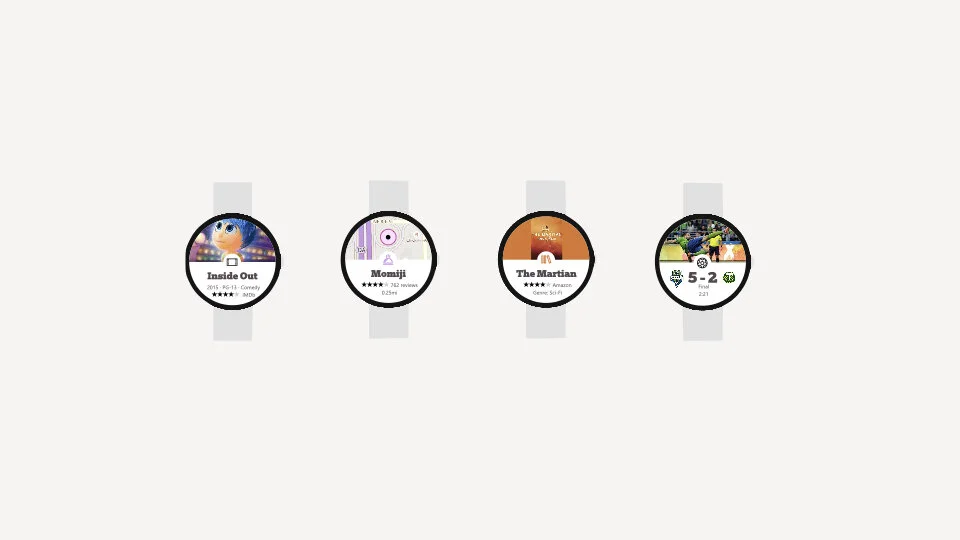
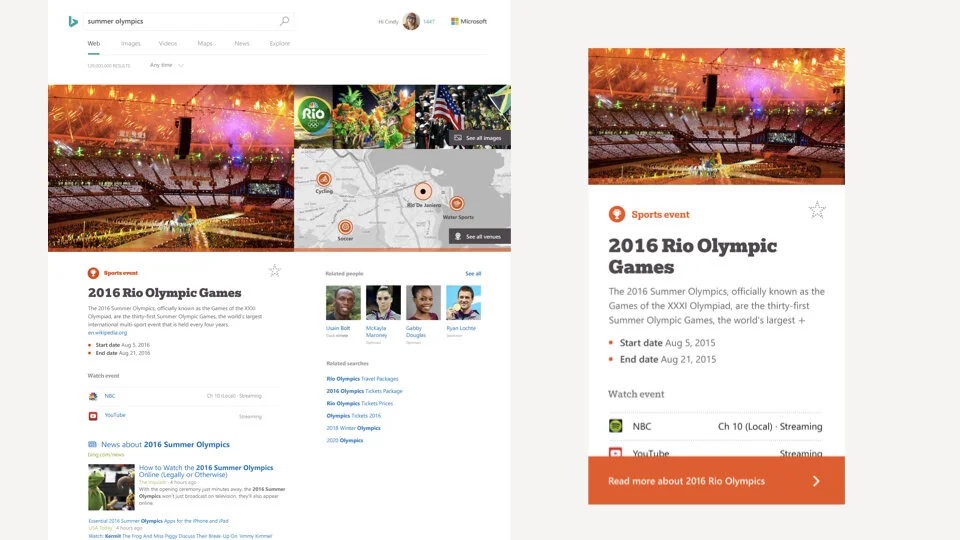
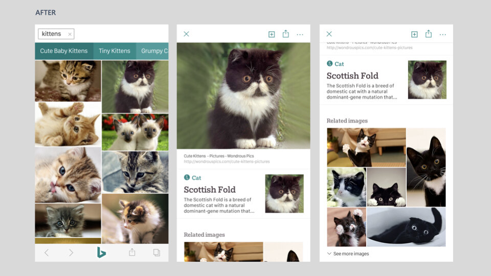
Scale Across Platforms
From coordinating with my team on a set art direction, I applied how the design language could work across search results for people, places, and things from mobile to web to smartwatch devices.
We conducted two rounds of design explorations seen below.
Impact
Executive leadership bought into the 2nd round of the teal-oriented brand design explorations and the work moved forward into iterations that shipped into product at the time.